Infographics in Newspapers (and Education)
Infographics add details and visual appeal to a news story and newspaper. Infographics include maps, graphs and charts. Maps represent the oldest infographic, dating back to 3800 B.C., according to one source. Close reading of an infographic requires reading words and images and often requires math skills. Writers who think visually will learn how to use infographics in their storytelling.. In Visualization Information in the News, Alberto Cairo described effective infographics as follows:
“by-products of well-organized information”
“devices to enhance the comprehension of information
“aids to thinking and understanding”
“concise but not simplistic”
“attractive but not decorative”
Newspaper readers may be drawn to a story by an infographic or struck by the message that a stand-alone infographic delivers. The attached organizers require young readers to interpret infographics in newspapers. EXAMPLES Project Information Literacy (PIL) created an infographic to show the results of a national study about college students’ research habits. Use Alberto Cairo’s characteristics to evaluate PIL’s graphic, found here: http://projectinfolit.org/images/PILResearchIGLarge.png
- What do you learn about research habits from the infographic?
- What more do you want to know and/or expect to learn from the “short video” on the Project Literacy Information website, http://projectinfolit.org?
- Based on what you learn and your own experiences, how do you think research habits for college students compare to research habits exhibited by elementary, middle and/or high school students?
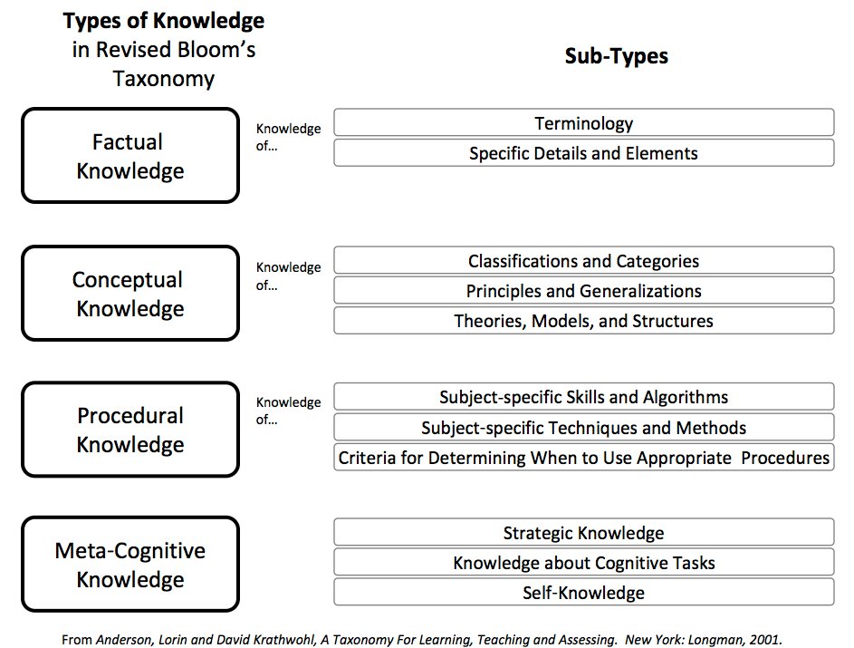
NC’s Essential Standards use Revised Bloom’s Taxonomy (RBT) written under the guidance of Lorin Anderson: http://www.ncpublicschools.org/acre/standards/ A longer explanation of RBT can be found on NCDPI’s wikispace: http://aplus.ncdpi.wikispaces.net/Revised+Bloom's+Taxonomy A quick Internet search shows varied visual representations (infographics) for RBT. Find one that explains well some aspect of the revised taxonomy and explain what you learn from the infographic. Use Cairo’s characteristics to evaluate the infographic you chose. Write a headline and subhead for the infographic. Ask yourself: What infographics do you find in books about different school subjects? What details do the infographics offer? How do those maps, charts and graphs support understanding the content?